Tufte vs. PowerPoint
Do not put your faith in what statistics say until you have carefully considered what they do not say.
In the September 2003 issue of Wired Magazine graphing guru Edwin Tufte blasted popular presentation product PowerPoint.
PowerPoint: "easy to abuse"
Disclosure: I consider Mr Tufte to be brilliant and a True Hero of UxP.
Mr. Tufte Said:
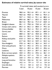
Consider an important and intriguing table of survival rates for those with cancer relative to those without cancer for the same time period. Some 196 numbers and 57 words describe survival rates and their standard errors for 24 cancers.
Applying the PowerPoint templates to this nice, straightforward table yields an analytical disaster. The data explodes into six separate chaotic slides, consuming 2.9 times the area of the table. Everything is wrong with these smarmy, incoherent graphs: the encoded legends, the meaningless color, the logo-type branding. They are uncomparative, indifferent to content and evidence, and so data-starved as to be almost pointless. Chartjunk is a clear sign of statistical stupidity. Poking a finger into the eye of thought, these data graphics would turn into a nasty travesty if used for a serious purpose, such as helping cancer patients assess their survival chances. To sell a product that messes up data with such systematic intensity, Microsoft abandons any pretense of statistical integrity and reasoning.
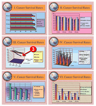
Charts and graphics are good for highlighting trends and anomalies. And they do so far better than a rich – but undifferentiated – table of data. Still, it’s deceptively easy to do it wrong with an “easy-to-abuse” tool like PowerPoint.
Context: It should be noted that Mr Tufte applied the Powerpoint chart templates willy-nilly to the textual data table, without regard for the appropriateness of the chart format to the data.
Obviously, "cancer survivability" implies a timeline - something that is poorly expressed through a generic barchart or piechart.
Is the Table of Numeric Data really that Good?

Although the numbers in Mr Tufte’s table are all there, I doubt that many of us could say anything meaningful about what they mean. The cancers are arranged in order of their initial deadliness – not their long term survivability.
Sure, there’s a lot of data there, but useful information about Cancer Survival Rates (which is the title of the data table) just isn’t obvious from its presentation in the table.
In fact, the largely unnecessary Standard Error numbers are really just "data noise" that interfere with understanding of Cancer Survivability.
Is Graphic Presentation really that Bad?
The relevant questions surrounding Cancer Survival Rates are not only “How deadly is it to begin with?” but also “How bad will it get?” - So the appropriate display is to show the data over a timeline.

In fact, Mr Tufte’s “bad” slide #3 (which uses a timeline template) makes it dramatically obvious that you’re far likelier to die of Larynx cancer after 20 years.
If this same timeline chart template is applied to the rest of the table, several trends that are hidden in the data really jump out at us:
For the most part, the mortality rate for the “most survivable” cancers generally tend to increase only modestly (about 5-25%) over time.
But the long term mortality rate for the “least survivable” cancers suddenly jumps to a 70-240% increase over time. The likelihood of dying from Multiple Myeloma increases by an appalling 600% over the course of 20 years.
NET/NET: An appropriate visual display of the numeric data lets us see that several cancers with reasonably high initial survival rates (Larynx, Colon, Non-Hodgkins and Leukemia are all in the 50-60% range) also have significantly higher mortality rates over time.
Is PowerPoint intrinsically that (informationally) Ugly?
Maybe it is: Any tool that is pre-formatted for push-button ease has built-in limitations.
But consider the alternative. The boring and opaque textual table of numeric data didn’t really show us anything meaningful either.
Disclaimer:
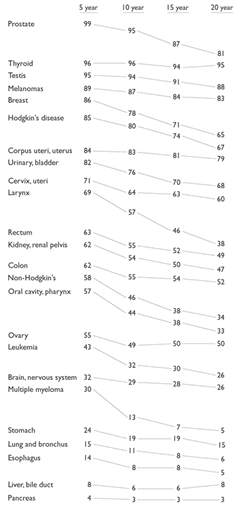
Although it didn't appear in the Wired article, in his original article Mr Tufte featured something he calls a "table-graphic" (shown at right) in which, as he says, "every visual element contributes directly to understanding."
You'll notice that the graphics, though understated, mirror the presentation of the data in PowerPoint slide #3 (above).
Someone - or some program - turned the table of numeric data into a low-fidelity version of a Powerpoint graph, wherein the survival rate values and relationships (not the data) are easily graspable.
Mr Tufte really only proves that:
- If you apply a set of inappropriate generic templates randomly to any information - It’s likely to look stupid.
- If you apply a chart technique appropriately - It works.
Vaughan’s Law: Anything – anything at all - can be done badly.
Deliberately illustrating his arguments with consciously bad design hardly proves Mr Tufte’s otherwise excellent points about the indiscriminate misuse of PowerPoint charting templates.
And he’s right: I recently saw an example in which Lincoln’s Gettysburg Address is reduced to a set of PPT bullet point slides. It showed compellingly how a “cookie cutter” technology can really kill the message. Our tools may be ubiquitous, slick and powerful, but there’s no automated substitute for human wisdom, talent and skill.