Wireframes
Wireframe page templates and the DemoSite prototype model are often the focus of UxP work.
They embody the "vision" of the design effort.
They are the reference point for stakeholder sign-off.
They are the basis for project documentation.
They provide guidance for code development teams.
The wireframe pages presented here were created as an actively "clickable" live HTML model that demonstrates both the organization of information and the experience of interaction.
I find it useful to "cut out the middleman" and go directly to a clickable wireframe demosite . Or at least design one-off's with that as the goal. Stakeholders always want to see The Real Thing as soon as possible.
View some Clickable Wireframe Demosite examples
View relevant case studies in my portfolio: Lead free Kids, Ingersoll Rand, Cap Gemini, SCANA, SchoolNet, Grey Interactive
Traction to Action
Groundwork
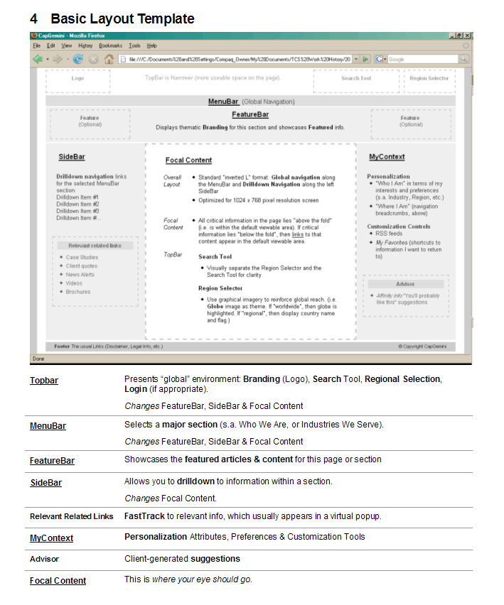
The example screens presented here are taken from the project document at right.
We lay the groundwork for how to view the templates with an explanation of our Design Conventions. They represent some of issues that are of greatest interest to stakeholders.
Layout - How we present information in a page
Affordance - How we show "what you can do" on a page
Features - How we describe UI functionality
Ultimately, we want to answer the question "How are the Wireframes in the Demosite Used?"
Go to the DemoSite document for how the DemoSite works.
Go to the SiteMap document for navigation & organization.
Design Conventions
These wireframes are not intended to indicate colors, styles, text content or even layout – The presentational attributes will be handled by the Creative Team.
The wireframe “styles” are intended only to indicate what we think the information content entities are, about how much screenspace they get, and how prominent they are.
We use levels of lightness and darkness to indicate prominence (where we’d like your eye to go).
The wireframe images are only approximate and indicative. They are not meant to imply a ready-for-production design stylesheet.
- Focal areas are brightest against a general light grey background.
- Featured info elements have an outline (they are probably more prominent).
- Title areas are emphasized with a bolder grey background
- Links are indicated in blue.
We look to the project stakeholders and champions to give us a sense of What Works, What’s Wrong and What’s Missing. We’d also like guidance on rankings of Importance.
Layout
The wireframe shows how we organize and present information.
A basic visual attribute of the Demosite page wireframe is Layout. This is the reality check that allows us to see "at a glance" that important information buckets are available - and which ones are most prominent.
Affordance
The wireframe exposes & explains what you can do.
An underlying theme of usability is Affordance: "The ability to do something".
Donald Norman: "The perceived ... properties of the thing, primarily those fundamental properties that determine just how the thing could possibly be used."
Features
The wireframe demonstrates UI functionality.
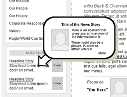
The image at right shows how a graphically enhanced mouseover News Story popup is a great way to provide a visual “hook” to that collateral resource.
Note: You probably got to this reference window page by clicking on a "document" - - icon in the MainWindow.
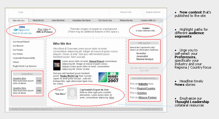
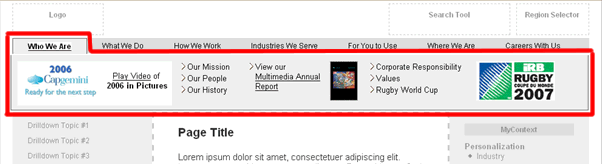
The image below captures the functionality of the MegaMenu feature. Basically, this is a “souped-up” dropdown menu with its own unique branding identity: When you mouseOver one of the menu tabs along the top, the hover panel presents visual "sizzle", as well as direct links to featured information.
There's a MegaMenu on the Home/Index/Landing page in the MainWindow of this site. Click on the link and then mouse over the options in the Menubar across the top ...
Because the wireframe in a DemoSite provides only shallow interactivity, we often need to describe how important UI features and functionality operate in the supporting document.
View relevant case studies in my portfolio: Lead free Kids, Ingersoll Rand, Cap Gemini, SCANA, SchoolNet, Grey Interactive
How are Wireframes Used?
Visualization Tool
“The Big Picture”
Captures navigation & flow
Integration of services
Management & All team members: Immersive “working model” of where we’re going
Structural Guide
The pages are valid HTML
The dynamic fields are tagged
Behaviors are identified and demonstrated
Templates & tags are embedded in the design
Coders: HTML Templates, CSS, Behaviors
Data Architects: Data Tags
Quality Assurance: Behavioral Guidelines, Navigation
Marketing Effectiveness
Experience Look & Feel
Enterprise Branding
Workflow “Reality Test”
Corporate Stakeholders: Consensus building
Clients: Acceptance, Signoff on workflow
Customers: Usability Testing